2023 Redesign / Branding Update
In May 2023, Sara wanted to give her branding a new look. While her business is still officially “Sara K. Yen, P.C.” – her “brand” name is “Yenlaw”, so we went with that for her logo. The look we decided on is a modern-retro typeface in order to give it a clean visual. We chose colors which also evoked a 2023 version of a 1970s wordmark. Her new color scheme includes several shades of tiffany blue, and apricot with the main staple of black. We did all the logos in each color, but the one she’s using the most is the primary logo in black. Take a look:
Primary Logo:
Primary Logo for Yenlaw (Sara K. Yen, P.C. Attorney) – Redesigned 2023
Secondary Logo:
Secondary Logo Design for Yenlaw (Sara K. Yen, P.C. Attorney) – Redesigned 2023
Logomark:

Yenlaw Logomark – Sara K. Yen P.C. Attorney – Redesigned 2023
Color scheme: Tiffany blue and Apricot
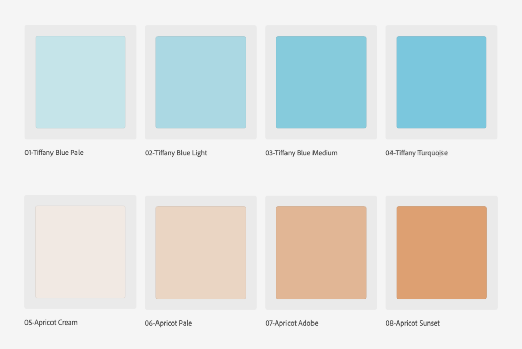
Yenlaw brand colors – redesign 2023
Other work done for Sara K. Yen: